CC-Rich-Text
A library designed to make it easy to lay out complicated screens of text, with support for different colors, fonts, sizes and images.

 |
 |
Intro
This is a library designed to make it easy to lay out complicated screens of text, with support for different colors, fonts, sizes, images, and other nice things that we're used to sticking in our documents. Hopefully this should make it a lot easier to have the kinds of colorful, vibrant displays you want in games!
Quick Start
Making it work is really simple:
-
Make a UIPanel item in your game UI somewhere.
-
Include the Rich Text Manager (_RichTextMgr) library in a script file, via
require(). -
Call the rich text function DisplayText(), with the text you want to display, with markup!
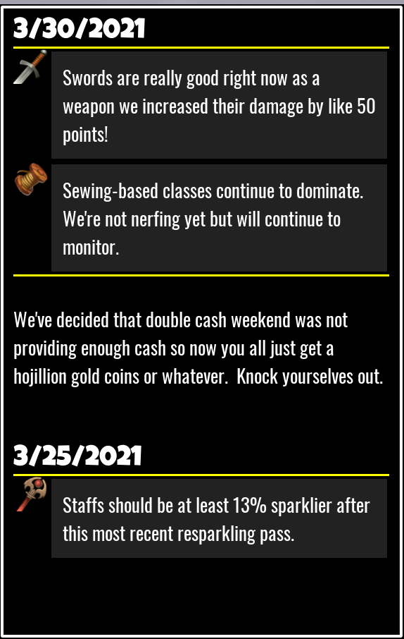
There are a few examples in the file RichText_EXAMPLE.lua
See the RichText_Example for a demonstration of this!
Markup
The rich text system allows you to mark up your text with various commands, to change how it is rendered.
For example, if you call something like this:
local prop_RichTextMgr = script:GetCustomProperty("_RichTextMgr")
local rtm = require(prop_RichTextMgr)

rtm.DisplayText(myUIPanel, "hello <color red>world</world>")
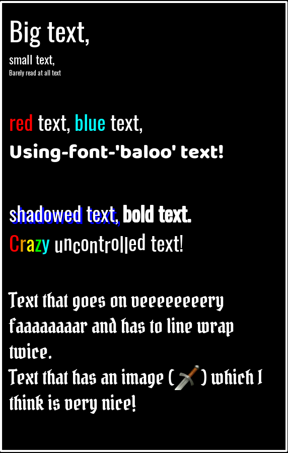
Then you would get:

There are a bunch of markup tags that the rich text library can accept. With them you have a lot of control over how your text gets displayed!
Function Reference
There are not many functions you have to worry about in this library.
DisplayText(UIPanel targetPanel, string text [table options])
| Argument | Details |
|---|---|
UIPanel targetPanel |
This is the UI panel that text will be rendered into. The text will line-wrap according to the width of the table. |
string text |
The actual text that is going to be rendered, along with any contained markdown. |
table options |
An optional table containing various optional parameters for the command. |
This is the main function that you will use with this library. When this function is called, it parses the text argument, and
creates a number of UITextField objects, as children of the targetPanel object. It returns a table with width and height
properties, describing the dimensions of the rendered text.
Note that the library does not handle any kind of cleanup! You are responsible for disposing of any created objects yourself. (either by deleting them directly, or by just removing the parent panel.)
Options accepted are:
| Options | Details |
|---|---|
| font | The starting font. |
| size | The font size to start with. |
| leftMargin | How far to pax the text from the left side of the panel. |
| rightMargin | How far to pax the text from the right side of the panel. |
| topMargin | How far to pax the text from the top side of the panel. |
| color | The starting color for the text. |
SetImageSource(CoreObject imageDir)
| Argument | Details |
|---|---|
CoreObject imageDir |
A reference to a hierarchy object containing custom properties that reference one or more images. |
Designates an object as the image directory. See "Font and Image References", below.
Font and Image References
When you need to specify a font or image, you can do it in two ways - either as a direct MUID, or as a plaintext name. In the case of fonts, the library already has definitions for the names - just enter them as they appear in the core editor, with underscores (_) instead of spaces.
For example:
rtm.DisplayText(targetPanel, "hello world", {font = "luckiest_guy"})
This also works in markup:
rtm.DisplayText(targetPanel, "<font luckiest_guy>hello world")
Alternately, you can provide the MUID string for the asset.
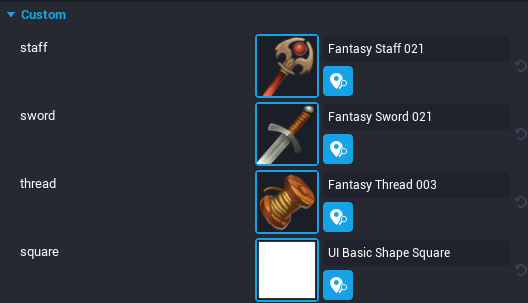
For images, you can create an "image directory" object in your hierarchy, and give it custom properties containing texture references.

If you then call the SetImageSource() function, you can refer to these images in your markup by their property names. For example,
rtm.DisplayText(targetPanel, "Here is some thread! <image thread>")
Font and image names are case-insensitive.
Colors
When specifying colors, they can be described as:
- An RGB set:
<color #FF0000> - An RGBA set:
<color #FF0000FF> - A plaintext color name:
<color red>
Plaintext color names can be any of the constants on the core Color namespace.
Markup Reference
This library supports text with markup.Markup commands are not rendered as text, but rather control how the text is displayed.
They follow a common format: They are surrounded by angle-braces, and the first word is the actual command.If arguments are provided, they are separated by spaces.Markup is not case-sensitive.
Example:
<shadow 4 4 blue>
the command is "shadow", (which adds a drop-shadow effect), and the arguments are the x/y offset for the shadow, and the color.
Note that unlike HTML, they are not comma-separated!
The full list of supported commands:
<color colorname>
Sets the font color.
</color>
Resets the color to whatever the base color was (if specified), or white otherwise.
<b>
Makes the text bold.
</b>
Makes the text not bold.
<shadow x y color>
Draws a dropshadow. x, y, and color are optional.
If provided, x and y are the offset for the shadow, and color is the shadow's color.
<outline size color>
Draws an outline around the letters, with a width equal to size, and in the color provided. All arguments are optional.
<font fontName>
Sets the typeface to the font name.
</font>
Resets the font to the default.
<size newSize>
sets the font size.
</size>
resets the typeface size to the default.
<offset x y>
Moves the text by x/y from where it would otherwise be rendered.Use this to line up text, or make lines look jiggy. If only one number is provided, it is used as the Y value instead of the X.
</offset>
Resets the text offset to 0, 0.
<justify justification>
Set the text justification. Can be either left, right, or center.
Only lasts until the end of the current paragraph.
<image imageName, width, height, color>
Inserts an image into the text.Width, height, and color are optional.
If Width/Height are not provided, they default to the current text height.
If width is -1, then it is assumed to span the entire panel.
<panel width color>
Creates a subpanel for text. Text in the subpanel will render and wrap independently of the rest of the text, and then the completed panel will be inserted into the flow as though it were a single large image or glyph.See the examples for a demonstration of what this looks like.
Width and color are optional.If width is not provided, it is assumed to be the remainder of the space between the last glyph rendered, and the right edge of the panel.
Color describes the background color of the panel. If left blank, it will default to transparent black.(#00000000)
</panel>
Indicates the end of a panel.
